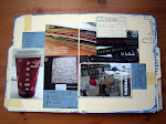
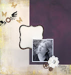
Method Playground Challenge 54 was to create a page inspired by something in a magazine. I chose these beautiful wedding themed, neutral palette pieces from the November/December 2009 issue of Somerset Studios. These pieces all had a vintage feel. While I loved the application of the neutral color scheme to the wedding theme, I wanted a slightly more urban, less vintage, feel. Here's my finished layout.
Step 1 - Spray a medium gray piece of 12x12 cardstock with graphite Glimmer Mist. Spread the spray ink around the page with your fingers. Allow to dry.
 Step 2 - Paint another piece of the same color cardstock with Tim Holtz's crackle paint in Picket Fence. Allow to dry. (No need to paint the brick shapes, I was headed in a different direction when I did that). Once the crackle paint is dry, seal it with gel medium. This will keep the paint from flaking too much during the later distressing steps.
 Step 3 - Cut 15 - 20 "bricks" from chipboard. My "bricks" are approximately 2-3/8 x 1-1/4 inches. Spray some graphite Glimmer Mist on a craft sheet and dip the edges of your chipboard "bricks" in the Glimmer Mist to get rid of those raw edges.
 Step 4 - Cut an equal number of "bricks" from your painted cardstock. Distress the edges of the painted "bricks" (I used a Tim Holtz distresser) and adhere them to your chipboard "bricks". The chipboard gives the "bricks" dimension.
 Step 5 - Subtly stamp a floral pattern on approximately 2/3 of your background paper. Emboss with clear embossing powder. I used a Cuttlebug embossing folder to stamp my background (just roll over with a brayer to get good contact between the embossing folder and your background paper. Emboss portions of the design with Stamp and Stick embossing powder and the foil with silver foil.
 Step 2 - Paint another piece of the same color cardstock with Tim Holtz's crackle paint in Picket Fence. Allow to dry. (No need to paint the brick shapes, I was headed in a different direction when I did that). Once the crackle paint is dry, seal it with gel medium. This will keep the paint from flaking too much during the later distressing steps.
 Step 3 - Cut 15 - 20 "bricks" from chipboard. My "bricks" are approximately 2-3/8 x 1-1/4 inches. Spray some graphite Glimmer Mist on a craft sheet and dip the edges of your chipboard "bricks" in the Glimmer Mist to get rid of those raw edges.
 Step 4 - Cut an equal number of "bricks" from your painted cardstock. Distress the edges of the painted "bricks" (I used a Tim Holtz distresser) and adhere them to your chipboard "bricks". The chipboard gives the "bricks" dimension.
 Step 5 - Subtly stamp a floral pattern on approximately 2/3 of your background paper. Emboss with clear embossing powder. I used a Cuttlebug embossing folder to stamp my background (just roll over with a brayer to get good contact between the embossing folder and your background paper. Emboss portions of the design with Stamp and Stick embossing powder and the foil with silver foil.


3 comments:
Congrats on the shout out on Ali's blog today!
Thanks to Ali's blog I've found you. WOW!
Beautiful work, as always!
Post a Comment