I'm applying for Method Playground's third(?) Design Team. Method Playground is a technique based challenge blog. If you're not familiar with Method Playground, check out the link over to the right in my "Blogs I Frequent" list. I'm creating this blog post so that those doing the deciding over at MP, only have to look in one place to see a bunch of my work.
Required Submissions: 3 Layouts
 I created this layout specifically for this application. I wanted to showcase my artsy style. This layout was ENTIRELY created from scraps left over from other projects. The background was created using the layering technique I provided step-by-step instructions for here. The blue wave below the photos was cut from a SKIRT! magazine (and sprayed with Archival Mist). The title was created by stamping on scrap canvas.
 This is a layout I created a couple of months ago. I believe it still showcases my artsy style, but shows how "artsy" can also mean "graphic" not necessarily messy or layered. To create the background I sprayed Glimmer Mist over a paper flower and removed the flower. The word "invisible" was cut from an office supply transparency with my Cricut. The journaling lines and journaling are done by hand.
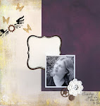
 I am including this layout for two reasons 1) it does not include a photo and 2) it showcases a number of techniques. This layout was created for a kit club I was a design team member for, so I had limited supplies to work with. To create the background, I stamped torn cardboard cut from the box the kit was shipped in (hey, that counts!) with bubble wrap and red ink. I then brushed some off white paint over the cardboard. The title was created from the outlines of letter stickers and the letter stickers themselves (sanded for texture). The rubon behind the word "box" was actually part of the rubon company's logo. The frame and wings were all one piece when I received them. I removed the wings from the frame, painted the frame black, and sanded the frame for a distressed look. "like no one is watching" was part of a rubon quote that I borrowed for my own purposes.
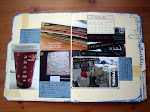
 This layout was submitted for challenge #30. The challenge was to create dimensional layers. The post describing this layout can be seen here. I actually won this challenge.
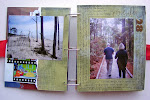
 This layout was submitted for challenge #5, which was to dress up plain jane embellishments. I chose to dress up plain silver brads. I used alcohol ink, Stickles, paint, and rubons to dress up my brads. I did not win this challenge, but that's totally ok, I had a ton of fun altering my brads. Here is a closeup (sorry, this layout was pre-blog):
 Not Required, additional layouts:

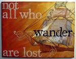


6 comments:
I think that these are great submissions and I wish you the best of luck!!
Good luck! :)
I hope you make the DT. Your layouts all look great!
Amanda--the one of you and Randy (ART)is awesome. You do amazing work!
your layouts are amazing!
awesome submissions. Good luck. They would be crazy not to have you.
Post a Comment