


Gals, this year, once Christmas is over, consider keeping your unused wrapping paper, or buying a little extra at after-Christmas sales. I find it is the perfect width to cover my work table for those "messier" projects. Just turn the wrapping paper over so that the unprinted side is up (so you don't inadvertently transfer color from the wrapping paper onto your project. I don't consider it a good scrappin' session unless I'm cleaning paint off the ceiling, so I've used this little tid-bit alot!
Sunday, August 31, 2008
Wednesday, August 27, 2008
And the Winner is....
ConnieC with this post:
"I have your post about designing acrylic pages saved. The whole "complimentary shapes" is a great idea. I've been a "back to back" acrylic scrapper, so I can't wait to try your way.I would love more ideas and sketches for acrylic pages and albums."
Thanks Connie, e-mail me your address at anberens@gmail.com and I will put your prize in the mail.
Congratulations Connie and thank you all for a wonderful 4 months. Here's to the next 4.
Acrylic Adhesives
Welcome back to your regularly schedule acrylic technique post! It's been a crazy couple of weeks. #3 Glue Dots: Again, the glue dots are visible. Although I have had some luck in hiding them in the pattern of patterned paper (imagine all the centers of your flowers are glue dots), then they're really hard to pick out. Again, pretty visible. The Xyron is pretty much as good as it got for "invisible". Although it's not because the Xyron adhesive is any less visible than the other adhesives, but because it is evenly applied and therefore harder to pick out. 1) Cover your adhesive with other design elements. It takes a little planning, but this is really a good "go-to" technique for acrylic. 2) Hide your adhesive in patterns or other design elements. 3) Use non-standard adhesives that are decorative in themselves like paint and Stickles. Hope you find this helpful. Let me know if you have any other recommendations of adhesives for me to try! Happy humpday!
So, I did something a little different today. I have heard alot of different opinions about which adhesive is the best to use with acrylic. And I definitely have my own opinions. So, I've done a side-by-side comparison of some of the most commonly used clear adhesives and what they look like when used on acrylic with light colored cardstock, dark colored cardstock, and patterned paper. Here are the side-by-side results:
Ok, so as I'm writing this post, I am soooo getting the desire to do this....
<<
#1, Glossy Accents:
I applied Glossy Accents three ways, starting from the left, 1) brushing it on, 2) dotting it on, and 3) swirling it on.
In all three methods you can clearly see where the adhesive is. Even with the brush on method, the brush strokes are clear. It's less noticeable when used with patterned paper. #2, Zip Dry:
Again, I applied Zip Dry in three different ways, starting from the left, 1) brushing it on, 2) dotting it on, and 3) swirling it on.
Again, in all three methods, the Zip Dry is visible. Although I applied about the same amount of Zip Dry as I did Glossy Accents, not as much of the Zip Dry seems to show. This is because the Zip Dry had a tendency to dry before I could even adhere the paper, particularly using the brush on method because it is such a thin layer. Because of its tendency to dry very quickly, I got really inconsistent results. The Zip Dry shows really well where it was still wet and not so well where it was already dry. Because the Zip Dry dried in some spots before I could get the paper adhered, the paper is not adhered very well to the acrylic. Also, I ended up with alot of strings of glue (you can see these particularly well in the "dotted on" section). Before I go on....Glossy Accents and Zip Dry seem to be the two most popular acrylic adhesives. They resulted in similar visibility. Of these two, I prefer Glossy Accents, here's why:
1) Glossy Accents does not have the strong solvent odor that Zip Dry has.
2) Glossy Accents does not dry as quickly, giving you a little more flexibility in placement and time.
3) Glossy Accents is water soluble, meaning you can easily wash it out of brushes, off your acrylic, and off your work surface with water. Zip Dry is not water soluble. You will need turpentine or another solvent based cleaner to remove Zip Dry.  #5 Xyron:
  #6 Glue Stick and Zig 2-Way Glue:
 Ok, so what now. Have I ruined any hope you might have of finding an "invisible" adhesive? Well, here are my recommendations:

Tuesday, August 26, 2008
5000!
Woo! Hoo!
5000 hits!
Comment on this post within 24 hours to be entered into the drawing for approximately $30 in STUFF from me! Make sure you tell me what you'd like to see me discuss in the future (techniques, discussion topics, anything!)
Good Luck!
September SFTIO Kit Sneak Peak
Here's a sneak peak of the September Scrapbooking from the Inside Out kit: Comfort!
Monday, August 25, 2008
Scallops, revisited
Sorry it's taken me a while to get this posted, but below is the link to the "how-to-scallop-a-rectangle" reference table that is a companion to the "how-to-scallop-a-circle" post, found here.
Scalloped Rectangle Table
The table includes scallop dimensions and number of scallops needed for squares and rectangles up to 12x12 in size. I hope you find this helpful.
Happy Monday!
Saturday, August 23, 2008
Farktography - Silhouettes
This week's Farktography contest theme is "Silhouettes". Some awesome photos, be sure to check it out, here.
For those of you who are not familiar, "Farktography" is a bi-weekly amateur photography contest run by the website FARK. Each contest has a different theme and some weeks the photos are just breathtaking. I try to link to the contest whenever the theme results in particularly interesting photos.
Friday, August 22, 2008
5000?
Look toward the bottom of the right hand column on my blog. See the hit counter? See how close it is to 5,000?
I started this blog at the end of April. In 4 months, you all have given me 5,000 hits. That's more than 1,000 hits a month. You gals (and guys, I'm sure) are awesome!
As a thank you, I'm going to do a giveaway. Just post a comment telling me what you'd like to see on my blog in the future (techniques, posts, subjects, anything!) on the day the hit counter hits 5,000.
As soon as I notice the hit counter hit 5,000, I'll add a new post for you to comment on. Just post a comment within 24 hours of the post time and I'll enter your name in the drawing. The prize will be approximately $30 worth of new(er) product from one of my favorite local scrapbook stores.
Good luck!
Way Behind...
Sincere thanks to those of you who wished us well during our "evacuation". The hurricane managed to perfectly miss the place we evacuated from and directly hit the place we evacuated to. Luckily we were not there at the time.
We were forced to evacuate because my hubby works in IT for companies that don't like to have their services interrupted, therefore, he is required to have electricity and an internet connection at all times....just in case. I have suggested surgical implantation of an ethernet cable, but alas....he has not yet bought into the idea.
Because of our evacuation, I am several days behind at work and even further behind in my creative endeavors. Currently my creative "to-do" list looks something like this:
- finish acrylic album
- compile "embellishing acrylic" posts
- finish September SFTIO Design Team assignments
- compile an application for the Clear Scraps Design Team
- make a submission for the Scrapbooking Trends magazine cover contest
- start working on my 2009 CK HOF entry (any body seen this years rules yet?)
- get a mixed media project entitled "Nothing" out of my head and onto canvas
- pick up special order 19x24 wet media acetate from local art store
Don't get me wrong, I'm not complaining. I would be more than happy to immerse myself in any of the projects listed above. Unfortunately, as I mentioned earlier, I am way behind at work (the engineering type). My work to-do list looks much more daunting and not nearly as much fun.
Thanks again for all the well wishes and keep an eye out for a couple of soon-to-be-posted, well....posts.
Monday, August 18, 2008
Hurricane Delay
This week's technique post will be delayed due to hurricane, and my forced evacuation from said hurricane. "See" ya when it's over!
Sunday, August 17, 2008
Tech Tips - Glimmer Mist
Ok, so I think I'm going to start an additional technique series here. I'm all the time stumbling upon tips, tricks, mistakes, etc. while I'm creating, which is all the time these days. A lot of these "mini-epiphanies" are not involved enough to qualify for the weekly Technique Hump Day post, but I think they are just as important to share. I'll publish these tips/tricks as I come upon them.
So for today, a footnote about Glimmer Mist. Turns out Mod Podge removes it. So, if you are wanting to use Glimmer Mist on a project you are planning to Mod Podge, I would suggest sealing the Glimmer Mist first.
Happy Sunday!
Wednesday, August 13, 2008
Scallops Anyone?
First, I must ask your forgiveness in getting off topic for a week. I know I planned to cover embellishment techniques for acrylic albums this week, but I've had too much going on personally in the last week to get that post together in time. Next week, I hope to be able to get back to the topic of acrylic.
But, that doesn't mean I don't have a cool hump day technique for you today!
Recently, I've found myself making scallops, in several different ways. First, I used the Cricut Design Studio to combine a large circle with small circles to create the large brown scalloped circle in the following layout:
 Also, in the layout above, I used a 3-inch circle punch to to create the black scalloped circle. In both these cases, my scallops ended up a bit....wonky. When using the Cricut Design Studio, I took a guess at the diameter of my small circles that would create my scallop. I didn't know if the diameter I chose would work until I got all the way around the large circle. By the time I got that far, I no longer cared if my scallops looked a little wonky!
I chose to use a 3-inch punch for the black circles in the layout above, simply because I HAD a 3-inch punch. But as you can see, my black circles don't touch each other, creating a not-quite-scalloped look.
I couldn't help but wonder if there was a better way, so I took my engineering skills and applied them to scrapbooking! Using a little bit of trigonometry I was able to come up with a method to relate the diameter of the inner circle, the diameter of the scallop, and the number of scallops for scalloped circles like that shown below. All of this information is summarized for circles up to 12 inches in diameter in this table: Scalloped Circle Table . Please tell me if you find this information useful. I have a how-to-scallop-a-rectangle version that is more complicated so I only want to post it if you find this kind of information useful.
Happy humpday....I now return you to your regularly scheduled acrylic technique.....
Tuesday, August 12, 2008
This Week's Hump Day Technique Will Be Posted Tomorrow Night!
I will be posting this week's hump day technique tomorrow evening. Sorry for the delay!
Be sure to check it out tomorrow, it's going to be awesome!
Tuesday, August 5, 2008
Designing Acrylic Pages
What makes acrylic pages unique also makes them sometimes frustrating to design: transparency. I've seen two basic schools of thought in regards to designing acrylic pages. The first school of thought: adhere your elements back-to-back to hide adhesive and the unattractive backs of photos and embellishments. The second school of thought: freestyle design, don't worry if your adhesive or the backs of elements show.
I'd like to discuss a potential third school of thought. I like to call it "complimentary shapes". Designing acrylic pages with complimentary shapes results in a page design that hides adhesive and the backs of photos and embellishments, but keeps your pages from looking "cookie-cutter" as they sometimes do with back-to-back design.
Here are some examples of designing with complimentary shapes. In these sketches, the gray signifies the back of a shape, the white represents the front of a shape, and the light blue represents a photo. All of these sketches assume you are using either cardstock or 2-sided patterned paper. You can use these sketches with 1-sided patterned paper as well, but you will need to adhere another piece of patterned paper back-to-back with your 1-sided patterned paper (to keep the back of the 1-sided paper from showing). Place your adhesive so that is will be covered by elements on the other side of the page.
Sketch #1 - I call this one "Bubbles":
 On the front of the acrylic page: A large circle grounds a 4x6 or 4.5x6 (standard digital size) photo. The backs of two smaller circles provide space for a title.
On the back of the acrylic page: The back of the large circle grounds three smaller circles. The three smaller circles provide space for an additional photo (or two) and journaling.
Here's how I used this sketch:


Sketch #2 - "Around and Around":
 On the front of the acrylic page: A scalloped mat grounds a horizontal 4x6 or two vertical 4x3 photos. The oversized mat and scallops provide space for a title.
On the back of the acrylic page: The back of the oversized mat grounds the smaller circles that make the scallops. The smaller circles provide space for an additional photos/journaling and the back of the oversized mat provides additional space for journaling.
Here's how I used this sketch (I haven't added the title or journaling yet):

Sketch #3 - Seeing Stars:
 On the front of the acrylic page: The back of one diamond and the front of a square form a star shape. The square holds a cropped 4x6 or a 4x3 photo with plenty of room for a title.
On the back of the acrylic page: The back of the square and the front of the diamond hold 4 2.5x2.5 photos (or a combination of photos and journaling).
Sketch #4 - The Long View:
 On the front of the acrylic page: A long mat holds a panoramic or a couple of smaller photos. The backs of two rectangles pull the eye across the page.
On the back of the acrylic page: The back of the long mat grounds two cropped 4x6 photos (or a combination of photos and journaling).
I haven't had a chance yet to use the last two sketches.
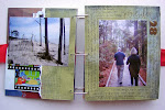
In general, you'll find that most acrylic albums use a combination of all three of the design "schools of thought" described above: back-to-back, freestyle, and complimentary shapes. Although one type of design will likely be dominant. The acrylic album I created a couple of months ago, found here, primarily uses a "freestyle" design. I used paint to cover the unattractive backs of elements as I went, with very little pre-planning. Although there are a couple of instances in the album where I used both "back-to-back" and "complimentary shape" design.
Hopefully you find "complimentary shapes" to be a helpful acrylic design technique. Next week I'll be talking about acrylic embellishment techniques and the following week I'll be debuting my new acrylic album.
Happy humpday!
Friday, August 1, 2008
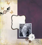
August SFTIO Layouts
August's Scrapbooking from the Inside Out kit theme is confidence. Here are the five layouts I submitted for the Design Team. And don't forget to check out the altered item I did for August in the post below (you won't want to miss it...).
Beautiful: 
Coming Out: 
Outside the Box (using the box the kit shipped in): 
Queen:  Journaling reads:
It's weird. I remember high school as this horrible time when I never fit in no matter how hard I tried. I remember being rather shy and introverted. I remember rumors...But then I see this picture of me during my senior year, preparing to leave for college. And although this crowd could never be considered the "in" crowd, I was obviously accepted...even well liked. Here I obviously had friends.Looking at this picture, the way I'm comfortably ensconced in the middle, with my feet up on the desk, and my arms draped around those beside me, you might have even thought I was Queen.It's weird.I don't remember having that kind of confidence. I don't remember being that comfortable in my own skin. I don't remember having that kind of presence, that kind of personality.I guess it's true, our memories have a tendency to hold onto the bad and the painful over the good and simple.
Soul:
August SFTIO Altered Item
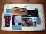
August's Scrapbooking from the Inside Out kit theme is confidence. For the altered item this month I created a bra-shaped mini book celebrating being girly (when girly I am normally not).
Cover: Inside Front Cover and First Pages:


 Second Pages:


 Third Pages:

 Fourth Pages:

 Back Cover:
 Journaling reads:
It took a long, long time...I hit 6'2" at eleven years old. In the 80's they didn't have "talls", so I was always having to buy boys clothes and boys shoes. I lived in jeans and t-shirts....and I played sports. I never thought of myself as sexy, but my husband did. It's taken years, but every once in a while I have a day when I feel girly. A day when I feel beautiful.
Subscribe to:
Posts (Atom)
