Sunday, October 26, 2008

Fly Away Home - Instructions

I created "Fly Away Home" for CK's 2008 Hall of Fame contest, the technique assignment. I've been meaning to post the instructions for a while now. Well here they are, finally!

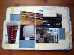
Here is the layout, it's 12x12 in total size but it uses 6x6 papers to create an eight-pointed star where seven of the "points" are tag pockets.


Here are the tags I created, but these instructions focus on just making the base.


You can download a pdf of the instructions below here .
Step 1:

Start with eight pieces of 6 x 6 paper. For explanation purposes, the top most piece in the design is designated piece No. 1 and is shaded the lightest color.

Step 2:

Lay piece No. 2 (yellow) under piece No. 1 (white) so that the left corner of piece No. 2 (yellow) is visible beneath piece No. 1 (white) as shown (2 1/8 inches from the corner). Adhere the pieces along the dashed line (sew if desired).
Step 3:

Lay piece No. 3 (orange) under piece No. 2 (yellow) so that the left and right edges are aligned with piece No. 1 (white) and the bottom corner of piece No. 2 (yellow) is close to the bottom edge of piece No. 3 (orange). Adhere piece No. 3 (orange) to piece No. 2 (yellow) along the dashed line (sew if desired).
Step 4:

Lay piece No. 4 (red) under piece No. 3 (orange) so that the upper right and lower left edges are aligned with piece No. 2 (yellow) and the bottom right corner of piece No. 3 (orange) is close to the bottom right edge of piece No. 4 (red). Adhere piece No. 4 (red) to piece No. 3 (orange) along the dashed line (sew if desired).
Step 5:

Lay piece No. 5 (blue) under piece No. 4 (red) so that the top and bottom edges are aligned with piece No. 3 (orange) and the right corner of piece No. 4 (red) is close to the right edge of piece No. 5 (blue). Adhere piece No. 5 (blue) to piece No. 4 (red) along the dashed line (sew if desired).

Step 6:

Lay piece No. 6 (green) under piece No. 5 (blue) so that the upper left and lower right edges are aligned with piece No. 4 (red) and the upper right corner of piece No. 5 (blue) is close to the upper right edge of piece No. 6 (green). Adhere piece No. 6 (green) to piece No. 5 (blue) along the dashed line (sew if desired).

Step 7:

Lay piece No. 7 (purple) under piece No. 6 (green) so that the edges align with piece No. 5 (blue) and piece No. 1 (white). Adhere piece No. 7 (purple) to piece No. 6 (green) along the dashed line (sew if desired).
Step 8:

Lay piece No. 8 (black) under piece No. 7 (purple) so that the edges align with piece No. 6 (green) and piece No. 2 (yellow). Adhere the upper left and upper right edges of piece No. 8 (black) to the whole construction using single sided tape on the back. Do not sew.

Step 9:

Lay the entire construction on a piece of 12 x 12 cardstock and trace. Cut the 12 x 12 cardstock to the shape of the construction. Adhere the construction to the trimmed cardstock being careful to make sure you do not inhibit the movement of the tags into and out of the pockets. If desired, single sided tape can be used prior to this step on the back of the construction to tighten the tag pockets.
Have a great week!

Wednesday, October 22, 2008

A Challenge Layout

I created this layout for a progressive challenge over at Scrapbooking from the Inside Out . If you're not familiar with progressive challenges, basically the challenge is posted in several parts, so you can't plan your layout ahead, you have to improvise each part. For example, you don't know how many photos will be required, or other challenge requirements.

I like how this layout ended up with a kind of 30's style Hollywood glamour (at least to me). The white background on the left hand side of the layout is actually my scanner bed, I cut the background down slightly so that my photo mat would hang off.
Happy Wednesday!

Sunday, October 19, 2008

Stamp Storage

Wow...it's amazing how a whole week can get away from you.

I've gotten/seen alot of questions about stamp storage methods, so I thought I'd share mine, it's a bit unique but easy and relatively inexpensive.

Behind my chair sits a bookshelf that hold a number of Cropper Hopper 12x12 vertical paper holders, which you can find here . These four paper holders hold my acrylic/unmounted stamp collection. My collection is organized (by Cropper Hopper dividers) into alphas (the first paper holder and 2/3 of the second) and nature, animal, themed, and geometric/swirly image stamps. I have about 3 dozen alpha sets and many-many-many image sets. This storage method is the most space efficient I've found. Each paper holder holds about a dozen 12x12 page protectors. Each paper protector holds two stamps sets, one on each side of the white paper insert.
Here's one of the page protectors. Large stamp sets I leave on the acetate sheet they come on when I purchase them.
Smaller stamp sets I remove from the original packaging and place on 8.5x11 acetate transparencies I purchase at an office supply store. This allows me to make the most of my storage space by combining smaller sets. I just write the name of the manufacturer above the stamp set.
I place the stamps in the page protector so that the acetate sheet is toward the plastic page protector and the stamp surface is toward the paper insert. This way the stamps don't stick to the page protector and they are easy to slip in and out.

Hope you have a good week!

Friday, October 10, 2008

My dream studio...

...would have this floor: Puzzle Floor .

I've been collecting thoughts and ideas about what my perfect studio would look like for years, just thought I'd start sharing.

Have a great weekend!

Wednesday, October 8, 2008

Gradient Paint Technique

This is a technique I use a lot. It involves combining paint colors to give a gradient, or subtle shift, in color across a canvas or paper. Here are some examples of where I have used this technique:

A corner-to-corner, multi-color gradient:
A top-to-bottom, one color (multi tone) gradient:
An inside-to-outside, multi-color gradient
A couple of things to note before we get started.

You don't have to stick with one color, but try to stay on one side of the color wheel. If you try to grade colors on the opposite sides of the color wheel (think purple and yellow) you'll get brown. If you stay with colors that are connected on the color wheel, you'll get a nice shift in tone. In the first picture above I used yellow, orange, and red. In the third, I used yellow, orange, and two different shades of brown.

If you're going to try the technique on paper, you'll need to seal it first, or else the paper will soak up the paint before you can get a nice blend. A single coat of mod-podge is all you need to seal the paper. Just let it dry thoroughly before painting or your paint will crackle (which is another cool technique).

If you are using thick paints (think Ranger's paint daubbers) you'll want to add a little water to your paints first, or else they dry to quickly to get a good blend. Just try to get the paint to the consistency of everyday craft acrylic paint and you should be fine.

I use foam brushes to apply the paint and do the first rough blend (the fat side of a 1-inch foam brush works really well for blending) and drug store makeup sponges and foam brushes to do some of the finer blending.

I usually end up using one foam brush for each color of paint (light, medium, dark) and one for each color transition zone (light/medium, medium/dark). So make sure you have enough brushes before you start.

As the paints get darker in color/tone, use less. Dark color paints will quickly overpower your gradient. In general, I try to work from the lightest color to the darkest color. Sometimes that's not possible, like in the example I give, below.

All right, here we go...I'm doing a one-color (multi-tone), corner to corner, double gradient for this example.

Layout all your paints and brushes/sponges before you get started. You have to work while the paint is wet, so the last thing you want to do is have to run after something. Go ahead and thin your paints with water, if desired, at this stage as well.
Lay on your lightest color first, then add the medium color, leaving a little bit of space between them.
Using a clean foam brush, blend a portion of the medium color into the white space and just a little bit of the lightest color, using a circular motion.
Next, blend more of the medium color into the first color blend. This starts creating a gradient of color.
Now go back and blend a little more of the light color into the first color blend (using a clean side of your foam brush or the brush you used to apply the light color in the first place).
Once you get these rough blends done, you can go back and blend the transitions between them with either a foam brush or a makeup sponge.
Keep blending until you're happy with the way the paint grades. Now add the darkest color (use a new brush), again with a little bit of white space between it and the color blend you've already done.

Repeat the blending process all the way back to the lightest color. Start by pulling the darkest paint into the white space. Then start blending the dark color into the medium color/light color blend.
In this case, since I am doing a double, corner-to-corner gradient, I am leaving some of the dark colored paint unblended for the next step.
Now I'm going to blend from dark to light in the opposite corner. The technique is the same. First, lay down the medium color with a little white space between it and the dark color.
Blend as above, pulling the dark color into the white space first and then blending with the medium color.

Then add the light color and blend as above.

Keep blending while the paint is wet. As the paint dries, you start to get interesting effects as you blend. Keep working the paint until you're happy with it. Once you're done, use your paint-loaded brushes to paint the edges of the canvas in similar tones to the canvas.
Here's my finished canvas!
Give my hubby a hand for taking the photos for this technique, or else I'd have one paint covered camera! Happy Wednesday!

Tuesday, October 7, 2008

A Challenge Layout

Here is a layout I made for a SFTIO October challenge. The theme of the month is joy and the challenge was to create a monochromatic layout (plus black and white) using the color that most makes you happy. Other requirements included more than one photo, visible journaling, a multi-font title, and use of either rub-ons or chipboard.
Happy debate-night!

Monday, October 6, 2008

A Layout for when you're feeling confused...

New layout....that I fear isn't going to make sense to anyone but me, but it's still fun to look at. The journaling in the corner says "Some days I just don't know what to think". Sorry, my scanner cuts off my edges (and also added a slight blue cast to the bottom of the layout).
Happy Tuesday (nearly)!

Sunday, October 5, 2008

October SFTIO Altered Item

The October SFTIO Kit comes with a scalloped, rectangular, sheer Maya Road album to alter. You can see the original album, here.

I had done mini-albums for the last two SFTIO kits, so I wanted to do something a bit different, here's what I came up with.

I made a 3-D flower by folding the album pages in half and joining them with eyelets. The leaves I die cut from the remaining album pages. I colored the whole thing with alcohol ink.

On one side I added photos and a title.
The other side I left plain.
I hung the whole thing by a ribbon.
So it can spin and you can see both sides.

Depending on the effect you wanted, you could cover both sides with photos or leave both sides plain. You could also cut down the pages to make a slightly smaller flower.

October SFTIO Layouts

Here are the layouts I made with the October SFTIO Kit, themed Joy.

Art Is:
This one is my favorite of the bunch, although it's a little odd because it doesn't have a stand out title, just a general statement that says "Art is the happy expression of the soul". The felt negative strip gave me some problems with placement or I would absolutely love the way this one came out.

Discovery: The fun part of this layout is the grid paper. I actually hand cut that from the Kaisercraft paper that comes in the kit. I totally love the way it looks. And with this page I finally proved to myself that I CAN successfully layer, I just don't do it very often.

You: On this layout, I hand cut around the white flowers only so that they would lay above my photo mat. This layout ended up with all sorts of construction issues. One of those black photo corners is actually hiding a title screw-up (before I condensed it down to just "You"). Hey, I'm not afraid to air my dirty laundry!

Pure Joy:This is my second favorite layout of the bunch. Although it's really simple, I love the sense of movement it has.