


Happy hump-day!
Recently, I came up with the idea of creating an acrylic album that could double as a piece of home decor. I wanted the viewer to be able to "get" the entire album by just looking at the front, but also wanted the album to contain a lot more than can be seen from the front only. I wanted the album to be relatively formal in appearance from the front, so that it could function as a piece of home decor. But wanted the album to be fun to flip through. Sounds like a lot of "wants", doesn't it?
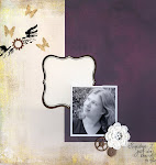
The concept I came up with for the album was the "evolution" of the relationship between me and my husband, which started in high school. From the front, the album appears to contain seven photos of us in chronological order, from the back of the album to the front. These seven photos are in black and white to unify them and to fit into any home decor scheme.
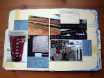
However, I used the "back-to-back" design scheme, discussed here, to hide a whole lot more in the album. Remember, you can click on any of the pictures to get larger, more detailed shots. The album is bound with black linen bookbinding tape, using the method discussed here. I etched the title "evolution" into the cover page using the technique discussed here. To finish the book I added a bit of stamping (corners) using Staz-on ink and some butterfly rub-ons.

 There is journaling hidden behind each black and white photo. The journaling is related to the time period of the pictures on the page facing the journaling.
 Each black and white photo also hides a color photo, behind it and on the underlying page. The color photo is of the same time period as the black and white photo on the same page.
 Each color photo hides a title block for the spread.

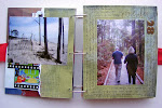
 The title blocks hide the journaling of previous pages as you flip through the book. Notice the butterfly rub-ons that were on the right hand pages are building on the left hand pages as the pages are being turned.


 I mounted photos that were not quite the right size on black cardstock.

 I added a final set of title blocks on the back of the book, to hide the last bit of journaling and the back of the last photo. When you look at the book from the back, all you see are the title blocks of the different phases of our relationship. I think this colorful, pattern and text-heavy back contrasts well with the black and white, photo-heavy front. You could flip through this album backward and get the same affect as frontward.
10 comments:
Beautiful album. I love that it has all the different layers. I'm marking this page, so I can try to recreate something similar.
ConnieC
This is such a great idea Amanda I love it, what a great idea for a wedding anniversary present.
WOW...this took an amazing ability to conceptualize. I think this is a one-of-a-kind beauty!
Oh My Goodness, that is amazing!! What a wonderful job and an awesome idea! I am soooo sharing this on my reader!!
Hi Amanda!!
This album is a showpiece!! It would also make an awesome wedding gift! I like the b/w for the front view and the contrast of the color pics on the backsides - it's like a burst of color when the viewer delves further. Also wanted to thank you a million - my package arrived safe and sound today and I'm excited to get a-scrappin'!! We're hunkering down now for Hanna! Cheers! Deb
Totally awesome!
You are a freakin' genius. Make sure you only use your powers for good.
p.s. you should definitely try to get this pubbed.
Wow!!!!!!
amanda, definitely this has to be pubbed. I don't think I know of anyone who could do such an artwork worthy of being copyrighted. and if this can be mass-produced, I'm way sure a lot of people will buy! I know I would!
Stunning, absolutely stunning. You have some serious skills!
Post a Comment