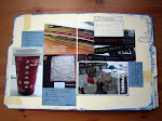
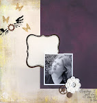
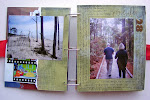
What makes acrylic pages unique also makes them sometimes frustrating to design: transparency. I've seen two basic schools of thought in regards to designing acrylic pages. The first school of thought: adhere your elements back-to-back to hide adhesive and the unattractive backs of photos and embellishments. The second school of thought: freestyle design, don't worry if your adhesive or the backs of elements show.
I'd like to discuss a potential third school of thought. I like to call it "complimentary shapes". Designing acrylic pages with complimentary shapes results in a page design that hides adhesive and the backs of photos and embellishments, but keeps your pages from looking "cookie-cutter" as they sometimes do with back-to-back design.
Here are some examples of designing with complimentary shapes. In these sketches, the gray signifies the back of a shape, the white represents the front of a shape, and the light blue represents a photo. All of these sketches assume you are using either cardstock or 2-sided patterned paper. You can use these sketches with 1-sided patterned paper as well, but you will need to adhere another piece of patterned paper back-to-back with your 1-sided patterned paper (to keep the back of the 1-sided paper from showing). Place your adhesive so that is will be covered by elements on the other side of the page.
Sketch #1 - I call this one "Bubbles":
 On the front of the acrylic page: A large circle grounds a 4x6 or 4.5x6 (standard digital size) photo. The backs of two smaller circles provide space for a title.
On the back of the acrylic page: The back of the large circle grounds three smaller circles. The three smaller circles provide space for an additional photo (or two) and journaling.
Here's how I used this sketch:


Sketch #2 - "Around and Around":
 On the front of the acrylic page: A scalloped mat grounds a horizontal 4x6 or two vertical 4x3 photos. The oversized mat and scallops provide space for a title.
On the back of the acrylic page: The back of the oversized mat grounds the smaller circles that make the scallops. The smaller circles provide space for an additional photos/journaling and the back of the oversized mat provides additional space for journaling.
Here's how I used this sketch (I haven't added the title or journaling yet):

Sketch #3 - Seeing Stars:
 On the front of the acrylic page: The back of one diamond and the front of a square form a star shape. The square holds a cropped 4x6 or a 4x3 photo with plenty of room for a title.
On the back of the acrylic page: The back of the square and the front of the diamond hold 4 2.5x2.5 photos (or a combination of photos and journaling).
Sketch #4 - The Long View:
 On the front of the acrylic page: A long mat holds a panoramic or a couple of smaller photos. The backs of two rectangles pull the eye across the page.
On the back of the acrylic page: The back of the long mat grounds two cropped 4x6 photos (or a combination of photos and journaling).
I haven't had a chance yet to use the last two sketches.
In general, you'll find that most acrylic albums use a combination of all three of the design "schools of thought" described above: back-to-back, freestyle, and complimentary shapes. Although one type of design will likely be dominant. The acrylic album I created a couple of months ago, found here, primarily uses a "freestyle" design. I used paint to cover the unattractive backs of elements as I went, with very little pre-planning. Although there are a couple of instances in the album where I used both "back-to-back" and "complimentary shape" design.
Hopefully you find "complimentary shapes" to be a helpful acrylic design technique. Next week I'll be talking about acrylic embellishment techniques and the following week I'll be debuting my new acrylic album.
Happy humpday!


1 comments:
Found you through 2Peas. You have an amazing blog that is a wealth of information.
Thank you!
Suzy
Post a Comment